
localhost, and show you the rendered page in the right-hand panel while you keep chatting. The user sees the design at the same time as the explanation.
The prompt
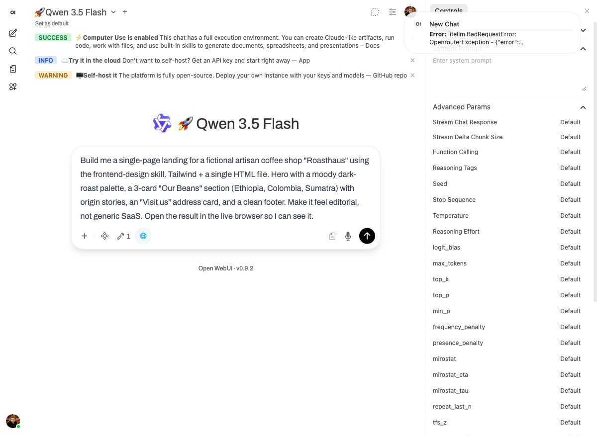
What happened
Thefrontend-design skill is opinionated about one thing: the result should not look like generic AI output. It nudges the model toward editorial typography, distinctive palettes, and intentional layout — instead of the bland Tailwind defaults that come out of a one-shot prompt.
Concretely, on this run the model:
- Read the
frontend-designskill’s reference materials (Explored str_replace, view). - Spawned a sub-agent to build out specific sections in parallel — the green
Sub-agentindicator was visible in the right-hand panel during the run. - Wrote a single self-contained HTML file with embedded Tailwind.
- Started a local HTTP server on port 8080 inside the sandbox.
- Opened
http://localhost:8080/roasthaus.htmlin the live browser tab. - Took a screenshot to verify the design rendered correctly.
Now I’ll create a moody, editorial landing page for Roasthaus with a dark roast aesthetic, custom typography, and distinctive design that avoids generic SaaS looks.
The output
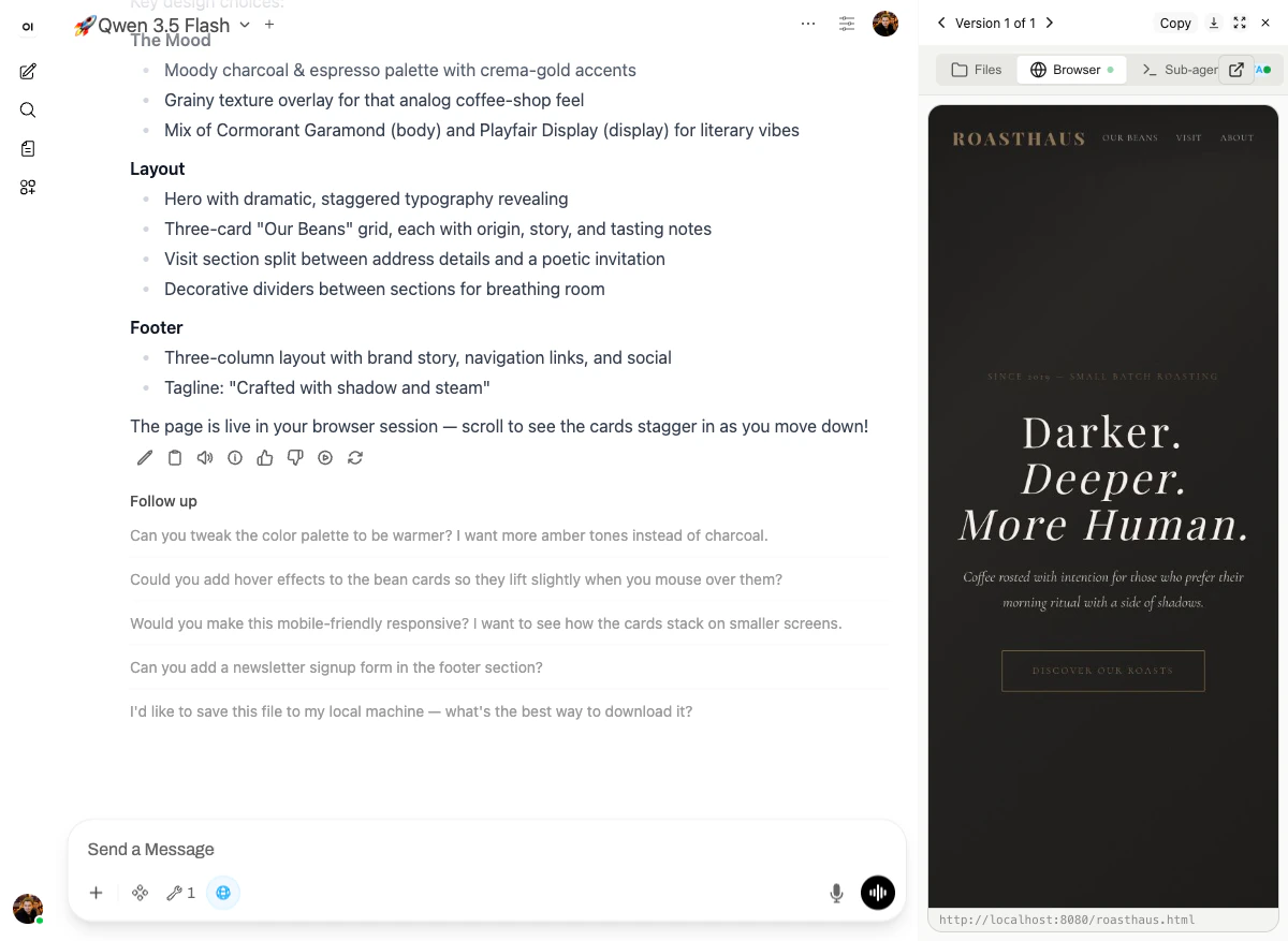
ROASTHAUSin monospaced serifs, navigation: OUR BEANS / VISIT / ABOUT- A small caption reading “SINCE 2019 — SMALL BATCH ROASTING”
- The hero headline: “Darker. Deeper. More Human.” rendered in a display serif (Playfair Display) at editorial scale
- Subhead: “Coffee roasted with intention for those who prefer their morning ritual with a side of shadows.”
- A “DISCOVER OUR ROASTS” call-to-action with a thin black border instead of the usual loud filled button
- The Mood: moody charcoal & espresso palette with crema-gold accents · grainy texture overlay for an analog coffee-shop feel · Cormorant Garamond (body) and Playfair Display (display) for literary vibes.
- Layout: hero with dramatic, staggered typography reveals · three-card “Our Beans” grid with origin, story, and tasting notes · Visit section split between address details and a poetic invitation · decorative dividers between sections for breathing room.
- Footer: three-column with brand story, navigation links, and social. Tagline: “Crafted with shadow and steam.”
The page is live in your browser session — scroll to see the cards stagger in as you move down!This is the demo working as intended: the user is looking at the actual product and can interact with it (scroll, click, inspect) without leaving the chat.
Why it works
Three platform features lock in here:- The
frontend-designskill provides design-system patterns (typography pairs, palette templates, layout grids) that resist regression to generic AI output. - The terminal lets the model start a dev server and serve the file.
- The live browser loads the served URL and renders it in a panel beside the chat — so the user can see and interact with the result in real time.