pandas to load the data, matplotlib to render it, and numpy to fit the trendline. The skill being demonstrated here is the platform itself — the fact that the model has a real Python runtime, real packages, and a way to surface PNG outputs back into the chat.
The prompt
The output
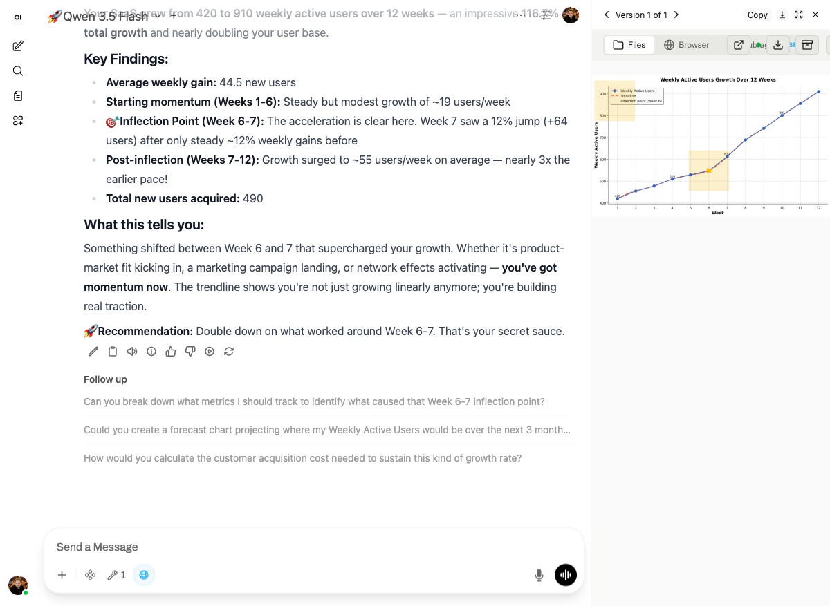
- Headline: “Your SaaS grew from 420 to 910 weekly active users over 12 weeks — an impressive 116.7% total growth.”
- Key findings: average weekly gain 44.5 users, starting momentum (~19 users/week for weeks 1-6), inflection point at week 6-7 (12% jump, +64 users in one week), post-inflection acceleration (~55 users/week — nearly 3x the earlier pace).
- Interpretation: “Something shifted between Week 6 and 7 that supercharged your growth. Whether it’s product-market fit kicking in, a marketing campaign landing, or network effects activating — you’ve got momentum now.”
- Recommendation: “Double down on what worked around Week 6-7. That’s your secret sauce.”
matplotlib PNG — line plot with markers, a fitted trendline, and two highlighted yellow regions calling out the starting-momentum phase and the inflection point around Week 6.
Why it works
Three platform pieces, no skill needed:- Code execution — full Python sandbox with
pandas,matplotlib,numpy,scipy, etc. pre-installed. - File mounts — the chart is saved to
/mnt/user-data/outputs/and surfaced back to the chat as an inline image. - The model’s own reasoning — given the data, it picked an inflection point and built a story around it. That’s not a skill, that’s the model doing what LLMs are good at, with real numbers in front of it.